Please add this URL to your RSS Reader.
Search Bloguru posts
Tai: Diary
https://en.bloguru.com/tai
Blog Thread
うさこちゃん
うさこちゃん
所用で実家に帰ってました。で、前からネタにしたかった事…去年久し振りに大阪に来た時、最初に驚いたモノです。
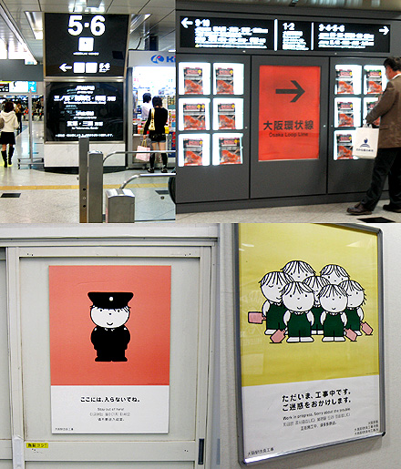
JR大阪の標識文字が大きくなり、色は黒+朱+青の3種に。遠くからでも読めますし、文字レイアウトが綺麗です。朱色は大阪らしい感じがしますし、青も明るくて綺麗。
看板は、うさこちゃんことDick Brunaに。大阪は多種混在しがちなイメージがありますが、ここはちょっと統一感があって素敵です。
http://www.nijntje.nl/
#product
2007-10-21 00:00 |
Comments(0)
|
Reply
|
Permalink
Share
Email
People Who Wowed This Post
If you are a bloguru member, please login.
Login
If you are not a bloguru member, you may request a free account here:
Request Account
introduction
By
Tai
calendar
84
84
05
2024
<
2024.5
>
S
M
T
W
Th
F
S
1
2
3
4
5
6
7
8
9
10
11
12
13
14
15
16
17
18
19
20
21
22
23
24
25
26
27
28
29
30
31
latest comments
hashtags
music
daily
concept
trip
work
product
study
shopping
finance
health
<
history
2024.5
2024.3
2023.12
2022.12
2022.10
<
Happy
Sad
Surprise