5 Frightening Web Design Mistakes
Oct
31
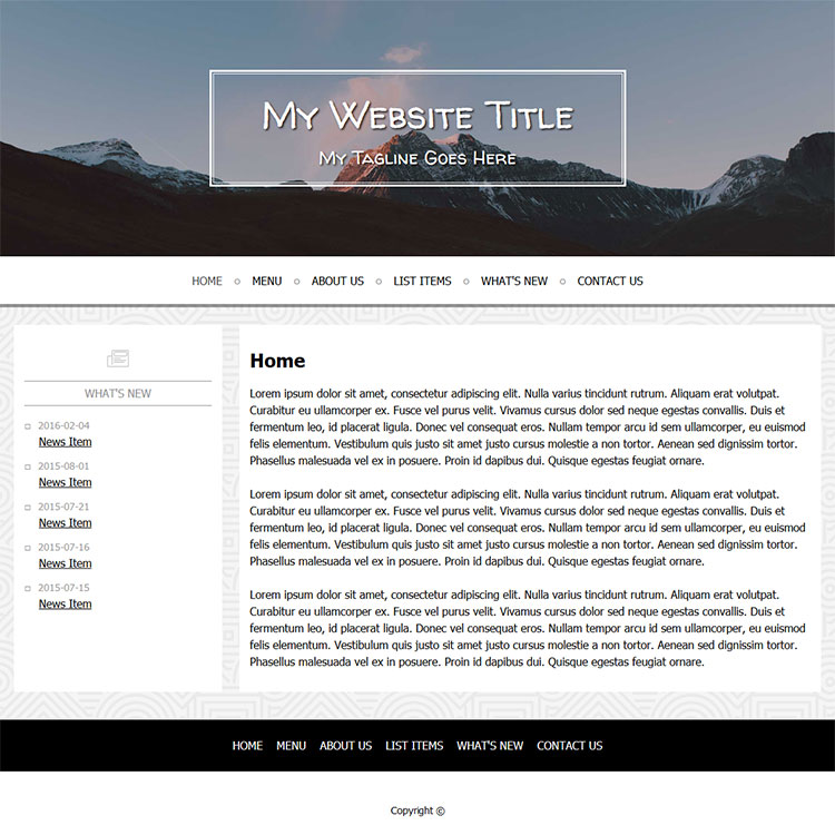
1. Confusing message. If your customers can’t tell who you are and what you do within the first few seconds visiting your site, why would they stick around? Make it clear right away what you do and what you sell.
2. Too much text. Okay too much of anything is bad. You can have too much text, too much white space, too many images, too many fonts, too many colors. This is where templates come in handy. A template can guide you in the fonts and spacing; you just need to add some high-quality content and imagery.
3. Hidden contact info. Your email, phone, address, or a contact form should be easy to find and readily available to people. If not, you may lose their trust.
4. Not mobile-friendly. A responsive design is a must-have. Your website should be easily viewable on all devices. Don’t expect that people are only searching and viewing your website from a PC.
5. No privacy policy. People may not take the time to read it, but for many of them, it’s a comfort just to know you have a plan in place for keeping their data secure. Get a GDPR approved privacy policy on your site asap.
Hopefully you’ve come away this month with some great ideas for designing or refreshing your company’s website. If you’d like to talk to the professionals, give us a call at PSPinc about customizing a site to your needs. We are here to make sure you have a great experience and come away with a BOO-tiful website!


